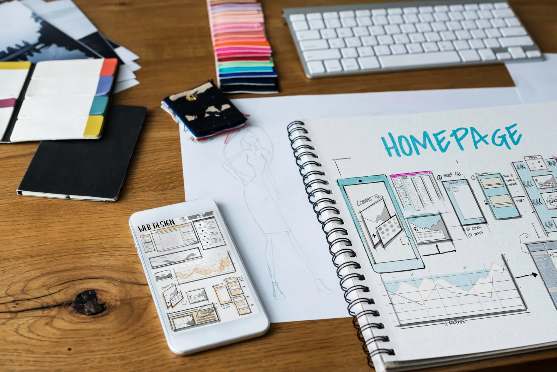
Creating an effective landing page is not an art, but a science. It is a mechanism with clear rules. Today, we’re going to take this mechanism apart and put it back together step by step. Are you ready to turn your future landing page into a real sales machine? Let’s get started!
What is a landing page (and what it is not)
First of all, let’s understand the terminology. A landing page is not just a single-page website. It is a specially designed tool whose main goal is to make a visitor perform only one targeted action (this is called a conversion).
This action can be different:
- Leave a request
- Call
- Order a consultation
- Buy a product (one!)
- Register for the webinar
- Download the application
Landing page is not:
- Your business card with all the services.
- Catalogue of your products.
- An all-inclusive corporate website.
All elements of the landing page work for the same purpose. No extra clicks, no extra distractions. Your visitor is a bully running towards the goal. Your task is to remove all obstacles from his path and provide the fastest and most convenient path.
Step 1: Diagnosis before treatment – study your audience and offer
The first and most important mistake is to start with design. No! We start with marketing.
Identify your target audience (TA):
- He’s sick: What is his pain? What are their problems, fears, desires?
- Solution: How does your product or service solve this problem?
- Language: How do they speak? What words do they use? This will help you write texts that resonate with them.
Formulate a unique selling proposition (USP):
This is the most important sentence on the entire landing page. The answer to the question: “Why should I buy from you?”.
- Bad: “We sell quality boots”.
- Good: “Boots that won’t make your back get tired after a 12-hour workday.”
Your USP should be: specific, beneficial and easy to understand. It should be placed at the very top of the home screen.
Step 2: Sales architecture – building the landing page framework
Here is a classic and proven structure of a selling landing page. Follow it and you won’t go wrong.
- The headline and the USP: Grab attention in 3 seconds. Answer the questions: “What is it?” and “What do I get?”.
- Short description: We detail the offer and reveal the benefits.
- Benefits (or features → advantages): Not just a list of characteristics (“polyester threads”), but what it brings to the customer (“they don’t wrinkle and last ten times longer”).
- Social proof: Testimonials, case studies, customer logos, number of units sold. It’s not you who is believed, it’s them. This is the strongest tool of trust.
- Presenting yourself (expertise): Who are you? Why can you be trusted? Briefly about you or your brand.
- Price and terms: Be transparent. A hidden price is the main enemy of conversion.
- Call to Action (CTA): The button that makes all the difference. It should be bright, contrasting and contain a verb (“Order”, “Get”, “Call”, “Buy”).
- Order form/contacts: As simple as possible. Ideally, just a name and phone number. Every extra field reduces conversion.
Step 3: Filling the framework with life – design and content
Texts:
- Write in simple language, as if you were a human being.
- Use short sentences and paragraphs.
- Put the main points in bold.
- Use different levels of headings for ease of reading.
Visual:
- High-quality photos: Your own, professional ones! Forget about stock “happy managers”. Photos of the product from different angles, photos of the work process.
- Video: A video business card or product review increases conversion by 50-80%!
- Infographics: Complex information is easier to present in the form of diagrams or icons.
Calls to action (CTA buttons):
- One main button should be bright and contrasting against the background of the website.
- The text on the button should be actionable and specific. Not “Send”, but “Order a consultation”.
- There should be several “Buy”/”Submit a request” buttons: at the top, after the block with benefits, at the bottom of the page.
Step 4: Technical optimisation – removing friction
Even a landing page that is perfect in terms of design can fail due to technical issues.
- Loading speed: The site should load in 2-3 seconds. Optimise images, use fast hosting.
- Adaptability: More than 60% of traffic comes from mobile. Your landing page should be perfectly displayed on a smartphone: large buttons, convenient menu, readable text.
- A simple form: Just a name and phone number. Each additional field (email, message) is an extra “friction” that scares off the customer.
- Online chat widget: Adds credibility and allows you to respond instantly.
Step 5: Test and launch
Before you put your landing page out into the world, ask yourself some controlling questions:
- Is it clear from the first 5 seconds why I am here and what I am offered?
- Does the offer make you want to use it?
- Is the information on the page trustworthy?
- Is it easy to find the order/purchase button?
- Does everything look good on a mobile phone?
Test everything! Be sure to check whether applications are being received by email/CRM, whether the phone connection is working, whether the communication with the Telegram bot is working correctly, etc.
Conclusion: The secret is simplicity and focus
Creating a landing page that really converts conversions into real sales is not about creativity for the sake of creativity. It’s about a clear path you pave for your customer from problem to solution. You are the guide. Forget about everything else. One product, one audience, one goal.
If you want to get a turnkey solution without having to dive into all these intricacies, our team of web development and marketing specialists will help you create a powerful sales tool that will start working for you from day one. Contact us for a free consultation and calculation of your project!
And remember: a good landing page doesn’t just inform. It sells.